The top challenge that business owners confront regarding their website is that it doesn’t produce sales or leads. This is especially the case for websites that were created without a marketing strategy or are DIY creations.
Whether you are redesigning your website, wanting to get more sales and leads, or considering paid advertising, here are eight factors to include in your website design to maximise your results.
-
Always design with your customer in mind
There are three things to keep in mind with the design of your website. The first is navigation (also referred to as the menu), then page structure and finally its ability to be easily used and navigated on mobile devices.
The more simplified your menu the better. If you have an eCommerce website with different product categories, colours, sizes, or shapes make sure you add these options to the menu or add a filter to the pages on your website. If you are serviced based, split your website menu into the different service areas. If there are more than three, it is better to add the main title like ‘services’ and then list underneath. Here are some great examples (if we do say so ourselves).


Page structure plays an important role on your website not only for your customer but for Google and SEO for your website. Also known as UX or user experience, ensuring your pages are not overwhelming is essential for a website that converts. Busy, cluttered websites with too many calls to action will overwhelm your prospect and lead to inaction. When it comes to website design and usability, often less is more.
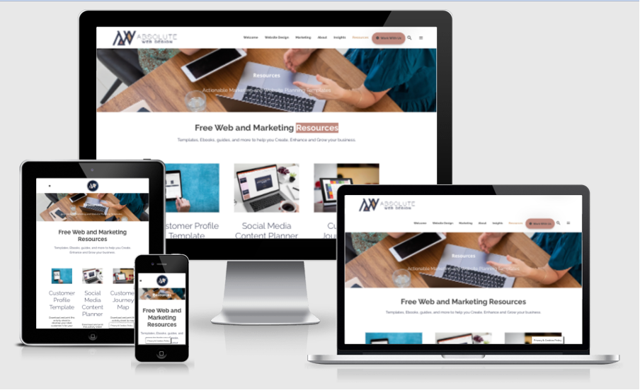
Did you know Australia now ranks second in the world in terms of smartphone usage? More importantly, 49% of Australians are using their phones to research and buy online. It’s no wonder that in 2021 Google moved to Mobile-first indexing. If people are coming to your site on mobile, they aren’t messing around. They want the design and navigation to be simple and easy to tap, and your site MUST be fast to load. Is your website mobile friendly? Take the test here.
Not too sure if your website is optimised for your customer? Download our customer journey template and make sure you’re providing the right information at the right time for every step of the customer journey. Want to make sure your website is mobile responsive? Add your URL on this website here to see what it looks like across all devices.
-
Make sure your website speaks to your customer and is about THEM
Can you tell your audience what problem you solve in 5 seconds or less? That is all the time you have to capture the attention of your audience on your website. If you’re lucky, you’ll have between 10-15 seconds before they decide if they will bounce or keep reading. In most cases, the decision is made in 3. This is especially evident if you see a bounce rate on your Google Analytics higher than 40%.
Understanding your ideal customer or client is the first step to crafting the right messages and copy.
Stop with the technical words and the fluff. Use words and copy that show your clients what is in it for them.
- Use headlines that tell them in a few words about how you will solve their problem. And most importantly make it about them.
- We don’t recommend using ‘our’ in anything unless you are writing your about page.
- Use clear benefit statements
- Keep your copy simple and scannable (too much and they won’t stay)
While it is important to include keywords on your page to have a chance of ranking your website with Google, it’s just as important to write copy that speaks to your ideal customer.
Do you have a clear picture and understanding of your customer? Find out more about how to create a Customer Avatar and download our template here. When you have a clear understanding of them your messaging will become easier.
-
Add the social proof and evidence
Adding testimonials, case studies, awards, media logos, accreditations and galleries to your website is the best way to build trust with your prospect. Take a look at these social proof statistics that show how important and powerful testimonials are:
- 97% of consumers look at reviews before purchasing.
- 50% of consumers visit a company’s website after reading a positive review. (HubSpot)
- Testimonials can increase conversion rates on sales pages by 34%.
- A single good review can increase conversions by a whopping 10%!
- Improving star ratings from 3 to 5 increases organic clicks in Google by 25%. (BrightLocal)
If testimonials and reviews are not currently part of your marketing strategy, they should be. Perhaps the idea of tackling an unsatisfied customer’s poor review is causing you some stress. Here are three steps that will help to implement strategies that work, and nurture a consistent five-star profile from gratified clients.
Ask your developer to add a feed of your Google reviews to your website. This way prospective clients and customers will know that they are not made up AND you won’t have to worry about having to update your website testimonials all the time. If you provide a service or product where images speak louder than words, ask your developer to add your Instagram feed to a gallery page. Again, this will automatically update, save you time and save space on your server making your website speed better.
-
Create a strategy to keep your prospects or customers coming back
Enticing a new prospect to your website is one thing but keep in mind you have to get them back 7-15 times before they buy. Have a marketing strategy in place to continually direct traffic to your website or landing pages with offers. Some ideas to keep them coming back for more include:
- Blogging
- Using landing pages with offers to keep them in your funnels
- Creating resources they can use time and time again
- Incorporate email marketing into your mix
- Create evergreen content you can use again and again with your emails and resources.
Does your business have a strategy to continually drive traffic to your website? Are you using social media, email marketing and other avenues? Take a look at your content and make sure you are maximising every opportunity to get them coming back for more.
-
Get them on your email list before they leave
When someone visits your website, most of the time they are in the awareness and consideration phase. They are researching a solution to their problem. Various industry leaders have said that on average only 25% of your website visitors will come back to and that in many cases they need to come back 7-15 times before they buy! That is why you need to get them on your email list before they leave. Only then will you have an added opportunity to warm them up to your services and stay top of mind when they are ready to engage your help.
Offer people something of value that will help them to make a decision or help in their research process. Also known as a lead magnet, offer them something in exchange for their name and email. For service-based businesses a checklist, a guide for solving their problem, a free no-obligation 30-minute consult, registration to a free masterclass or even an evergreen webinar that talks about how to solve a problem themselves. Chances are they will try but will still need your help. For eCommerce businesses, a discount code or dollar value off their next order with you in exchange for their email is the most common one you will see.
Not only will your lead magnet build your database, but it also fulfils the strategy of upselling, keeping them on your website longer and bringing them back to your website.
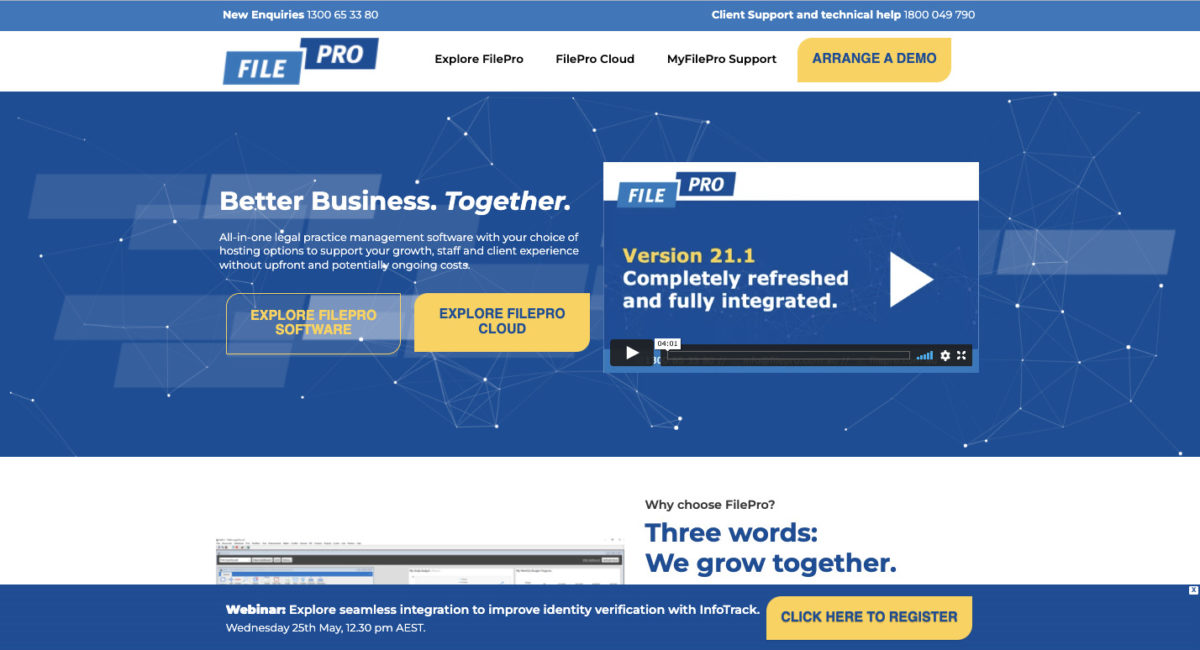
A great way to do this is to add an inoffensive pop-up bar to the header or the footer of your website and create a stand-alone landing page so you can send them directly to the lead magnet on your social media channels. You’ll see a great example right here on the FilePro website.

Do you have a lead magnet on your website? Is it clear and does it provide value? A good lead magnet can not only build your database of prospects but make it easier for you to convert them into customers or clients.
-
Site speed
You only have 3-5 seconds to get someone hooked on your website to read further, what happens if your website takes 7-15 seconds to load? Chances are you’ve already lost them. According to various SEO experts, speed is one of the top 10 items to focus on when it comes to getting the basics right. If you have a slow website, you’re not only losing people, you’re losing chances to rank higher.
Three items that slow your website down include;
- Large images that are not optimised
- The choice of hosting provider with loaded servers, and;
- If your website is created using WordPress, you could have unnecessary plugins that should be deleted.
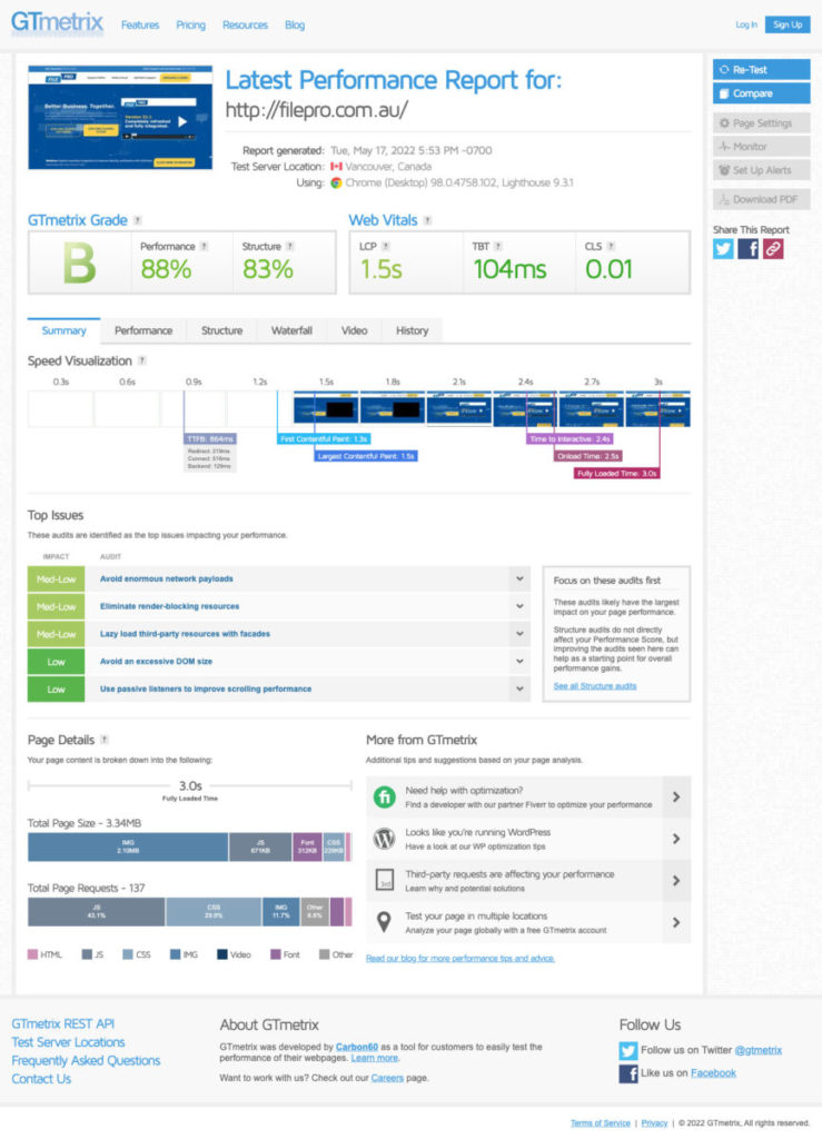
A great place to check your website speed is through GTMetricx. It will unlock all of the information you need to make your website load faster.
We use GTMetrix to test our websites. You’ll see that the FilePro website is a great example of an optimised website. Click here to test yours. Does your website need some optimisation? Ask us about our website optimisation package today.

-
Add in the upsells
Upsells are one of the biggest missed opportunities we see with websites and marketing. If you have an eCommerce website there is a chance to upsell at the product add to cart level or at the checkout. For service-based businesses, the best upsell is at the download/thank you page once someone adds their details to a form. For each action make sure there is another valuable, relevant action to keep them there longer or take the next step with you. Using your customer avatar and customer journey will help you to map out the right steps.
If you haven’t got a follow-through process or thank you page attached to your contact form offering the next steps then add one now. Ask them to follow you on social media or make sure that the download can be accessed the minute someone enters their details. The longer you can keep them on your website the better.
-
Make it SUPER easy for them to take action
One of the biggest failures we see with websites is difficulty in locating contact details. Have you ever had the need to contact someone at Telstra? It’s not easy to find their contact details, is it? And how does it make you feel? That’s right. Totally and completely FRUSTRATED. Don’t make this mistake on your website. Can people easily see how to get in touch with your business? The new FilePro website is a great example of how to make it easy for your prospects and clients to reach out. As an added bonus the phone numbers are clickable so they can click and call.

Too many calls to action can be confusing so here are three tips for making sure your website page has the best chance of converting them to a warm lead or customer.
- Decide what it is you want them to do on the page.
- Make sure your call to action is prominent
- Be strategic about where you place them.
Look at each page and think about what it is you want them to do. Do you want them to buy, register for an event, book an appointment, or fill out a form? Make sure it is clear and you only have one.
While you might have some or even all these items on the checklist on your website, always be sure to test placement and review the results through your Google Analytics. It will give you an insight into what you could do next to increase your website performance.
Need some help turning your website into a lead generation machine? Contact us for a complete website review where we not only review these items mentioned in this post, but also provide you with a detailed report and recommendations on the next steps you can take to turn your website into a high performing, high converting, results-focused machine. Check out our website review package here.
About the Author
 Katie provides clients with complete marketing solutions from branding to website design right through to lead generation campaigns, content creation, and social media. From strategy to implementation she can support you to create, enhance and grow your online presence. Having worked with a range of clients providing services from different industries and sizes, her clients benefit from a personalised approach, which results in customised strategies and the right tactics so you have a better return on your investment. Katie wants what you want. Results and greater success for your business, so you keep coming back for more! Are you ready to shine online? Get in touch here to chat about working together.


